As I have previously mentioned the Hit Club visual identity was released last Thursday, to go with it I designed, and had printed, a limited run of posters to be given away free at the exhibition. Above are two ideas I designed that we considered for the poster however we decided not to go with.
Tuesday, 28 July 2009
Monday, 27 July 2009
Best Of Manchester Exhibition - Urbis
The Best of Manchester Awards were held last Thursday night at Urbis. Max Moran who I work with on the club nights, web site and now record label (along with Dan Market) won the music award which was great. The opening of the exhibition went well and is now open until the 20th September.
There are limited edition Hit Club posters free in our display on the plinth in front of the Hit Club logo, they hadn't been put there when this photo was taken.
The night also served as the launch for the Hit Club Records visual identity. The logo can be seen above. I also designed a set of 4 posters 1 advertising Hit Club and 3 advertising bands we are going to release soon. The Egyptian Hip Hop poster can be seen in a previous post.
The photo above was taken just before we cleared away the ladder, box and other posters on the floor.
Saturday, 25 July 2009
Campari Soda Bottle - Another Classic
After posting the piece about the brilliantly designed wrapper I found at my friends house I decided to try and find more examples of where graphic design doesn't need updating and gives off an sense of elegance. One example I found was the Campari Soda bottle designed by Fortunato Depero. I really like the fact that print wasn't used instead sculpted into the bottle was the information needed. Also the textured surface has more importance than just grip. The tactile element on the bottle also leaves an impression on the user distinguishing it from other bottles of drink.
Depero was primarily an artist involved in the Futurist movement however designed this bottle for Campari in 1932.
Tuesday, 21 July 2009
Hit Club Posters
As part of the exhibition we are unveiling the new Hit Club identity and with it a series of posters to promote the new bands we like. This is the first one for Egyptian Hip Hop - www.myspace.com/egyptianhiphop. It will be on show at the Best of Manchester Awards at Urbis so go down and see it if you have any spare time.
Sunday, 19 July 2009
Urbis
Edward Ruscha
I visited the Tate Modern the other day while walking down south bank. While wandering around the gallery I found many interesting and beautiful pieces including some work by the brilliant M/M Paris, however that's another post for another time. While walking around the space "artist rooms" kept coming up, this was simply a room full of one particular artists work. One of these rooms was dedicated to Edward Ruscha, his work really stood out to me. He used typography boldly and made messages really stand out using cleverly chosen typefaces along side striking colour or images. Some of his work is pictured above and more can be found at www.edruscha.com, his web site has some amazing work which continues to experiment with typography and language.
My 2 favourite pieces were the top 2 images above. This was due to the amazingly painted landscapes that incorporated intense bright natural colours and amazing scenery contrasted with a very modern, electronic and almost robotic typeface that carried messages about modern society. The pieces are very large in the gallery, perhaps 8 x 8 foot, this gives them a huge impact on he viewer and really draws one in.
In my opinion his work offers an interesting take on how typography and language are used and how they can be used along side images or colours to enhance a message.
Friday, 17 July 2009
Classic Packaging Doesn't Age A Bit
My friend has a bit of an obsession with Tunnock's biscuits and, as a result, has a lot of these wrappers lying around his house. I think his appreciation for these sweet biscuits is as much for the packaging as it is the product and I can see why. The wrapper above is a brilliant design. It has a classic style that seems to always be relevant and makes it stand out amongst other mediocre designed food packaging. The classic striking use of red and silver coupled with the circular text is really interesting and made me want to find more packaging that has a similar effect.
Wednesday, 15 July 2009
Sara De Bondt
I saw this work by Sara De Bondt a while ago and thought it was really clever. The logo (above) is for the building pictured and, in my opinion, it work really well with it. The bold, striking typeface and the and bright colour really seem bring life to the building and make the viewer look at the building in a different light. Also the detail on the E is brilliant, the way it picks out that detail on the building is really interesting.
Tuesday, 7 July 2009
Greg Lamarche
Greg Lamarche is based in America and has some really nice work. I found him on www.itsnicethat.com which is a great design blog. His work reminds me of the brilliant typographic experiments Alan Fletcher did in his book Picturing and Poeting. The playful use of type using different colours and fonts I find really interesting and when done well it looks very striking.
Thursday, 2 July 2009
Ah Um
5NYDAYS
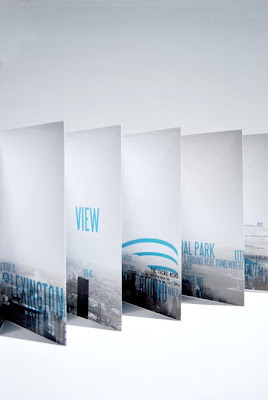
I previously posted some development work from my 5NYDAYS project. Well now it's finished and above is the result. It documents 5 days I spent in New York and is designed to be a new take on a guide book that inspires and intrigues people instead of telling them directly where to go and what to do. It includes bits of conversations from when I was out there that tell people where curtain attractions are, ticket stubs, addresses and much more.
Monday, 22 June 2009
Jiminie Ha
Monday, 15 June 2009
Street Style Photography
I regularly check The Sartorialist, most people do, his pictures are beautifully shot and everyone he takes photos of is dressed really well. It's a great source of inspiration. However I chose to post this image because of the colour and the really interesting typography on the wall behind the lady. All these elements combine made this picture stand out.
Pentagram for The Public
After posting the old Paula Scher poster for The Public a couple of weeks ago I thought I would post the new poster campaign Pentagram have created. It is a stripped back and brilliantly thought out poster that references the style of the older posters and has wit and attitude which is what I feel Alan Fletcher used to do so amazingly.
Alexei Brodovitch
This is the work of Alexei Brodovitch, he was a great designer and worked for man years at Harper's Bazaar. These are a selection of his layouts and a typeface he designed. I really like the work because it is so striking and yet incredibly elegant. All the elements of the page sit together brilliantly. I also think the typeface is amazing due to it' variation in weight of line and bold yet elegant appearance.
Subscribe to:
Posts (Atom)